

Overview
From the initial user research, I found that potential users are looking for a Money-Saving app they can easily understand, that is also trustworthy and motivational.
Objective
Since personal finance can be daunting to people with limited experience in the topic, I’m aiming to bridge the knowledge gap between users and their specific financial goals.

A finance app for non-finance Users?

“I want the money-saving tool I use to be motivational so that I stay on track with my goals.”

“I want to see a dashboard of my finances clearly and visually so that I can see how much I am spending on what at a glance.”

“I want to see an overview of how much my finances have changed and how much I am saving throughout the saving period so that I can stay on track.”
Stakeholder
Career Foundry UI Design Course
My Role
UI Designer
The Tools

Timeline
1 Month Project
UI Project Plan
Part 1: Design
Flow Diagram
Low-Fidelity Wireframes
Prototype Creation
Part 2: Evaluation
User Testing
High-Fidelity Mockups
Final Thoughts
Part 1: Design
Flow Diagram

The main goals for this Flow Diagram were to make the path to the user tasks as efficient as possible while organizing a clear path the users can rely on.
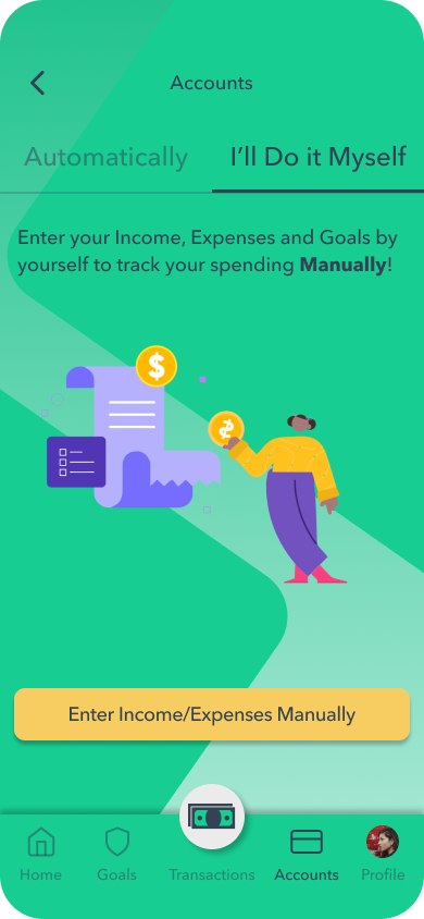
A challenge I encountered was the way the users were to enter their income/expenses information. On the first design iteration, there was only one option, the user entered manually their transactions. User testing proved this feature to be outdated for younger users. For that reason, I included an automatic feature for users to link their accounts.
Low-Fidelity Wireframes

After gathering some inspiration from similar apps and taking into account the tasks users want to achieve, I decided to start sketching my first set of wireframes with pen & paper to have more creative freedom while developing the desired foundation.
Now that I have a better idea of the interface and functionality of the app, I can check for any usability issues and address them.
Since I consider user testing to be amongst the most important tools a UI designer could use, I like to set up a mid-fidelity mockup to be used as a prototype to incorporate the principles of Lean UX Design: Think, Make, Check as quickly as possible.
Part 2: Evaluation
Prototype / User Testing
To know if the design choices I made will work in the real world or not, I need feedback from potential users using Figma to share a mid-fidelity prototype.
After gathering notes (both positive and negative) from all 5 testers, I used my knowledge of Nielsen’s error severity rating system to address the findings and prioritize accordingly.
The error rating goes from 0 (least severe) to 4 (usability catastrophe) but, I only included feedback corresponding to 2 (Minor usability problem), 3 (Major usability problem), and 4 (Usability catastrophe).
Sign Up
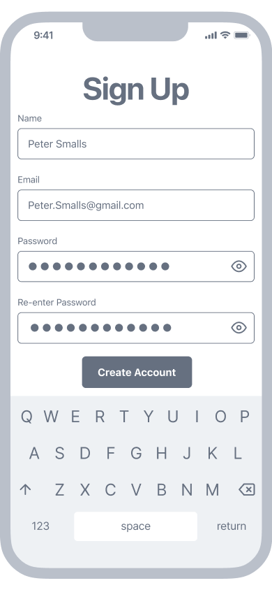
An alternate layout for the Signup screen. (2)
Income

Users expressed confusion with the “next” button. (3)
Expenses

No use for buttons if they have navigation tabs. (3)
Goals

Users were confused by the “Finish” button. (3)
The image was not clear to users. (4)
Home

A graph-like tracker rather than an arrow. (4)
A more outstanding goal title. (3)
Visibility on the amount of savings progress. (4)
Spending and income automatically uploaded to the app. (4)
A screen that shows their spending and income. (3)
Percentage progress of their goal. (3)
High-Fidelity Mockups
Splash Screen

Sign Up

Accounts (Auto)

Accounts (Manual)
Income (Manual)

Expenses (Manual)

Goals

Home

Final Thoughts

As far as the original objective goes, Wiser Penny delivered a solution to its target users in a user-friendly way. Users can easily access their goals, and savings progress to get a better understanding of their specific situation without the finance jargon that can be overwhelming.
User Testing played a key role in this project as I uncovered the specific expectations and needs of the target users. A great example was the feedback from users requesting percentages and graphs to help them track their savings goals. This helped me steer the design towards a more suited interface that better serves the users.
For future iterations, I would like to develop more features like the ability to see details in the users’ transactions, motivational notifications, and all other minor usability findings like cosmetic errors from Nielsen’s error severity rating system.